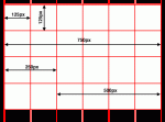
 Grids are the core foundation of any design. Think of them as an invisible skeleton upon which visual content is arranged. They structure information so that the viewer can easily assimilate and retain it. They make compositions more aesthetically pleasing. They enhance user experience online. Grids came into public awareness during the International Typographic Style (Swiss Style) of the 1950’s but have in fact been used since the beginning of human history. Even the earliest cultures have employed grids in their town layouts, architecture, and art. The most basic grid systems are usually made of intersecting horizontal and vertical lines (a universally adopted standard) that tend to have a “grounding” effect and are perhaps linked to man’s earliest relationship with time and space: the movement of the sun in relation to the horizon. More advanced grid systems can be made with complex geometry, contain multiple layers, and be three-dimensional or even organic.
Grids, however, seem to have a very low priority in today’s visual design, especially for web developers.
If you are a designer, I urge you to study and understand grids. Grids are tools that we should learn to use and recognize, since it is up to us to create a future rich with effective and engaging communications. Below is a breif slideshow presentation that will help you to begin to understand the Grid System.