In Design, you should always be encouraged to take a good look at the lines in a photograph that you’re trying to combine with text and graphics.
Repetition is one of the most important design principles and this is a natural implementation of that idea. By analyzing the photo and following its directionality, you sometimes can find incredibly easy ways to make your graphics and text look truly integrated, as if the image was created expressly for the purpose you’re using it for, a great illusion !
The first step using the lines in a photo is to analyze the image’s content and use any hard lines to help align your artwork in a very literal fashion.
It is important to note that not every image will lend itself to the technique. However, learning to be more aware of how the existing content in a photograph can be used to guide and inspire you to create unique designs that break away from the cookie cutter mold that’s so easy to fall into.
Let’s take a look using first, some easy analysis
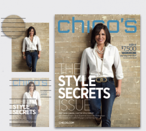
The bricks in this photo form natural blocks. Headlines are set conventionally and stacked, making complimentary blocks.
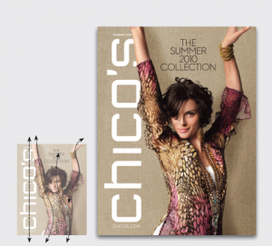
Next , a long tail blouse, plunging V-neck, and a sweeping, fluid pose yield a beautiful sleek top-to-bottom line which gets amplified by the vertical nameplate.
www.chicos.com
Lastly, we’ll be using a method that’s very similar to the repetition methods above, but in a more complex manner.
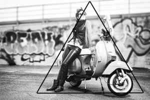
If we think about the strongest natural lines in this photo (below), they don’t really stretch across the image like those in the previous examples. Instead, we see a very defined pyramid take shape.
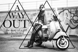
We can use this shape as inspiration for how we place our text on the page, just as we did with the bird photo. To do this, draw the lines that make up the triangle, then copy that triangle and place it in the area to the left. Finally, use this new triangle as a guide for text placement.
Notice that, in the final result below, we didn’t actually continue the pyramid shape all the way to the bottom. Instead, my lines of text seemed to naturally conform to an almost diamond shape, and that’s completely acceptable. Once again, you’re making the rules here so feel free to distort and rethink the natural lines in the photo rather than simply taking them so literally.
Photographs by Daniel Zedda


