Building your Graphic Design Portfolio
When trying to break into the field of graphic design, having a solid portfolio is crucial. If you are job-hunting, your portfolio is what employers will be looking at to decide whether or not to give you an interview. If you are starting a freelance business, potential clients will be comparing portfolios to choose a designer for a project. There are several choices for what type of portfolio to build, and each has their own benefits and considerations that you may need to look at.
Website
Online portfolios are probably the most popular type today. As a graphic designer, some will even assume you have a web site. If your focus is web design, an online portfolio is the choice for you, as it serves as an example of your work.
Benefits:
- Easy to send out…it’s just a link
- Can provide a look into your personality
- Allows for an interactive presentation of your work
Considerations:
- The most time consuming to create
- You have to worry about it looking or behaving differently from computer to computer
- You need the technical knowledge to set it up
- Expensive to hire someone to develop it for you
- You will have to pay for a domain name and monthly web hosting (although both can be accomplished for a little over $100/yr)
Creating a portfolio as a PDF is becoming more and more popular. Using Acrobat, multi-page PDFs can be created from layouts created in a graphics software program (such as InDesign or Photoshop). The result is a brochure style piece that shows examples of your work along with descriptions of projects and related information.
Benefits:
- Easy to email
- Control over layout without having to worry about browser and web issues
- The PDF itself serves as an example of your layout and typography skills
- Can be printed with consistent results
- Relatively quick and free to create
Considerations:
- Relies on the user to save and open the file
- Less effective for showing web design projects
The Classic Portfolio
The classic portfolio, an actual book of various sizes with printed examples of your work, still serves a purpose in today’s “digital world.” There are several ways to present such a portfolio, from placing prints in a pre-made book with sleeves, to creating your own custom, bound book.
Advantages:
- Shows your work in its actual, final format
- Great for showing off print design
- Can be brought to a meeting and shown without a computer
Considerations:
- Must be delivered by mail or in person
- If you leave with a potential client or employer, you are left without a portfolio
In the end, the type of portfolio you choose to have will depend on your budget, available time and type of work. For web designers, an online portfolio is a no-brainer. If you don’t have the time or budget to set up a web site right now, you should at least have a PDF so you have something to email. A classic portfolio is great to bring to a meeting and show off your best print work.
As a portfolio is a key marketing piece, it should be taken seriously, and a combination of the options above might be the right choice to get you your dream job or client.
Best advice, try to have all three of the above portfolio types (cover all of your bases!). Remember, you are marketing yourself , you are the brand! Never settle for only one method of presenting you and your work!
The Zone System – Better Black and White Photography

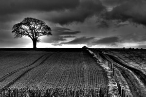
In traditional black and white photography, the aim is to present a picture where there is at least one area of the picture which is as dark as your display medium, whether it be printed paper or a computer screen, will allow and another area which is as bright as it is possible to be.
If you have achieved this, the picture is said to have maximum contrast and the image will appear punchy and alive, with very rich tones.
Pictures with too little contrast appear dull and grey and can even be described as muddy. In the days when I worked in a darkroom, I never tired of the tremendous difference between a flat, tonally poor print and that of a full contrast photograph of the exact same negative.
As with all good things in life, one can have too much contrast in ones images. If a picture is displayed with too much contrast, the detail in the lightest and darkest areas of the image will disappear into black and white. While this is acceptable for small parts of the photograph, it can be troublesome if huge swathes of detail are lost into oblivion.
There are, of course, situations where the photographer will intentionally create a lower contrast image, with whites that are not completely white or where the darkest parts of the image is toned in grey rather than in full black, but the key is to be able to get to full range of contrast from your display medium, and then break the rules if you need to do so for visual effect.
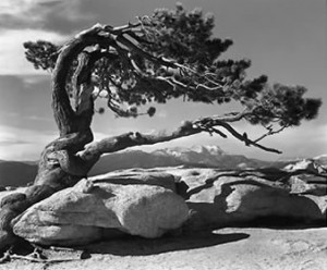
Contrast has been taken so seriously by photographers over the ages that Ansel Adams, arguably the finest black and white landscape photographer in American history, devised a system to get the maximum amount of contrast out of every single picture he printed.
The Zone System for Digital Photography
The zone system is basically a technique used to display pictures with the full tonal capabilities of the display medium. Though Ansel Adams applied the system mainly to pictures printed in a wet chemical darkroom, the system is as relevant, regardless of whether you are shooting on a digital camera or on negative, and whether you intend to display on a laptop screen or a wet chemical print.
In the zone system, the properties of the display medium are assessed, and the range of tones that it is capable of producing is divided into ten zones. The first zone, zone zero equates to complete black, as dark as you can get out of your medium, zone one can be described as near black, with detail just about visible in the shadows. Zone two would represent dark grey, while zone three holds the tones in the medium dark area. Zone four is the shades just darker than the average and zone five those just lighter. Zone six will be medium light grey while zone seven is best described as light grey. Zone eight holds all the lightest detail just visible before it disappears into zone nine, pure white.
When Ansel Adams printed his masterful work, he always made sure that each of these areas was represented in the final print. This ensured that his photographs always contained the full tonal range available and gave his images an unrivalled richness and vibrancy.
Photography Tip: Lighting is everything

Lighting is everything. Learn to see light and position yourself to capture natural light in its most flattering state.
What do I mean by this? Most people stand with the natural light behind them so that they are photographing into a scene flooded with light. This light is great for a fast expose, but tends to “flatten” a scene because everything has the same intensity and lighting. If you positioned yourself so that you are shooting into the natural light you create a very dramatic “back-lighting” which has much more shape and form.
Try to set up the composition in your view finder so that lighted areas over lap shadowed areas. This will create a wonderful sense of depth in your photo. Overlapping will also create strong contrast in the composition and tends to help the sense of form in your picture. Taking the same shot with different exposure settings will also drastically change the quality of light in your photo. It is a good practice to take several different shots with under exposed and over exposed settings to make sure you will return to the studio with at least one shot perfectly exposed.
Look for things that can add character or drama to your photo. Directional lines help create a sense of movement in your photo. Position yourself to take pictures with strong visual lines that travel through your picture. This means that the line should enter from one side of your picture and leave the photo on one of the three other sides of the photo. Diagonal lines are the most productive for drawing the viewer into your picture and creating depth. Lines can also be made by changes in light (light to shadow), the edge of two objects meeting, tonal changes and warm to cool changes.
Black and White Photography a new reality!
 Black and white photography is a rewarding and challenging field of artistic photography. Even people who don’t care about photography can find themselves drawn to a great black and white image. As a photographer, black and white can allow you to discover a whole new character in a familiar subject. For many digital photographers, black and white photography is nothing more than colour photography converted by software. It is a matter for your own judgement whether this is effective for your photographs.
Often the image you assume will convert beautifully to black and white will prove a disappointment; sometimes a photo you never imagined will surprise you. However, most serious photographers will tell you that the best black and white photos are taken when the photographer deliberately sets out with black and white images in mind. This creates an entirely different mindset in terms of how you choose and approach your subject. You may, for example, start to see potential in subjects you would never normally consider for colour photography.
If you have never had a serious go at black and white photography, here are a few simple tips to help you get started.
- « Previous Page
- 1
- …
- 60
- 61
- 62
- 63
- 64
- …
- 71
- Next Page »